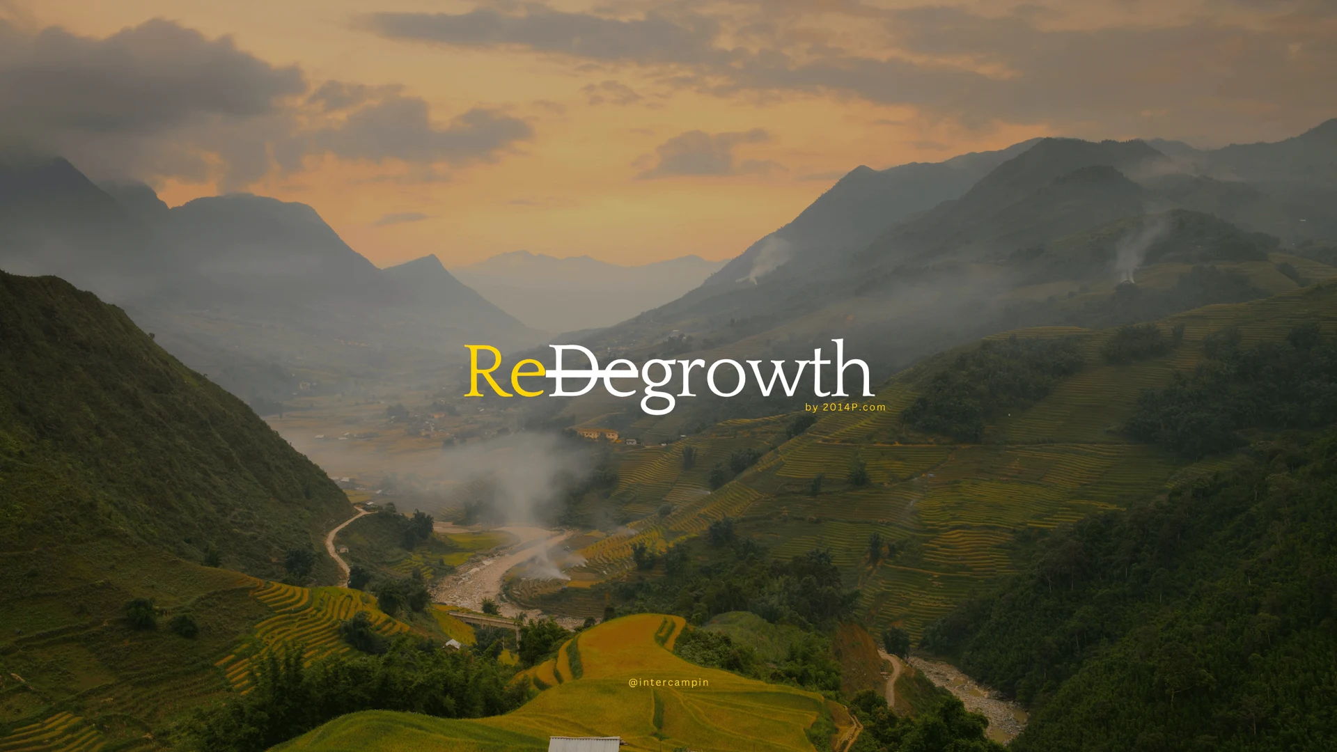
Theory of ReGrowth
The primary series artwork and the anchor for our visual system. Keep the complete composition; its title is already part of the image.
Original artwork · PNG ↓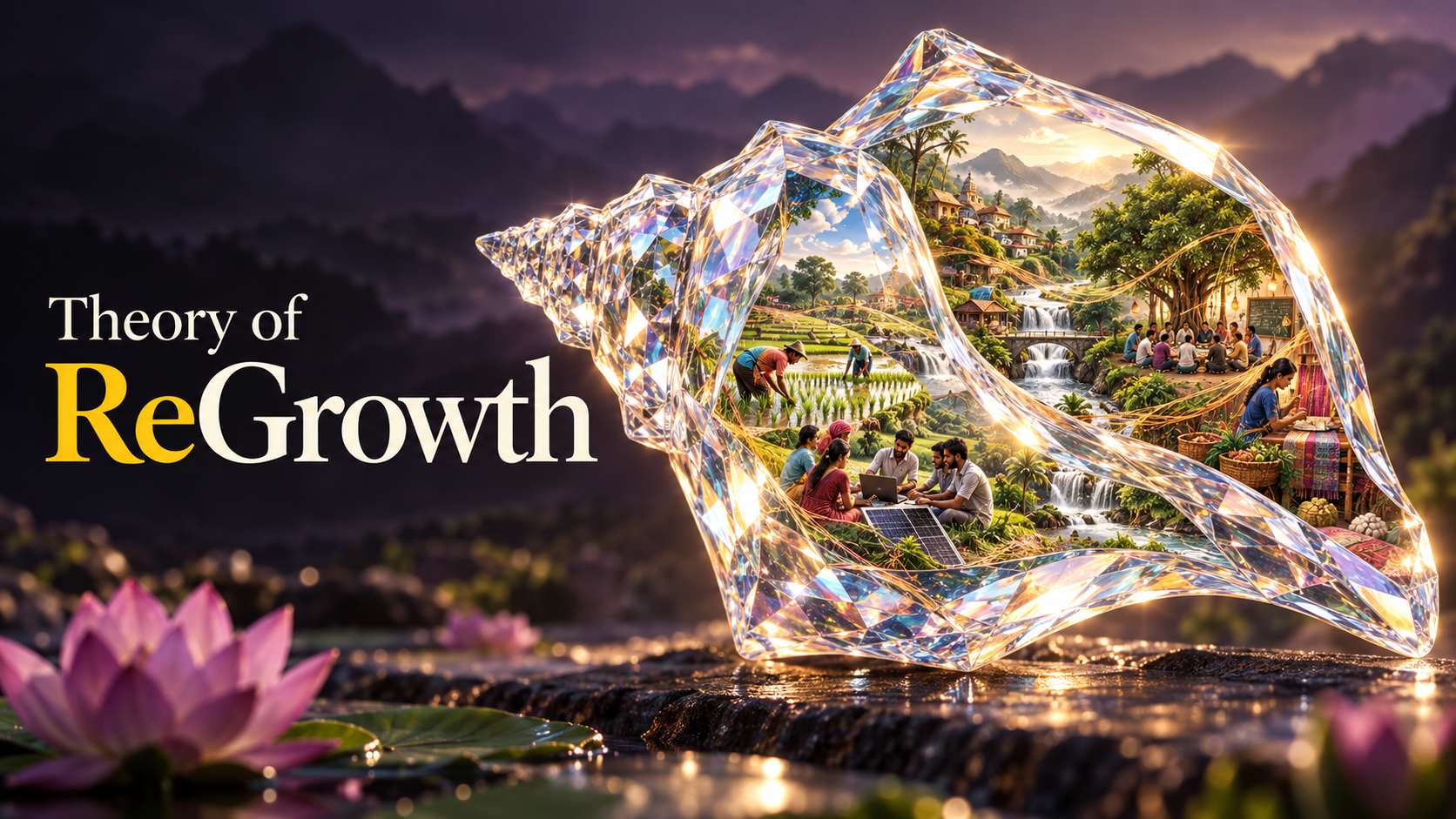
Website version · WebP ↓
ReGrowth · Brand library / 1.1
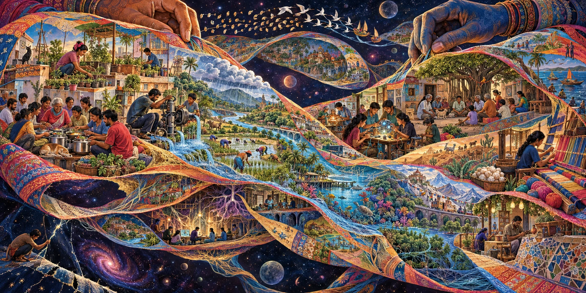
Our visual language brings together the crystalline conch, the living tapestry and the warmth of yellow on ink. Here are the assets and principles for carrying it into the world.
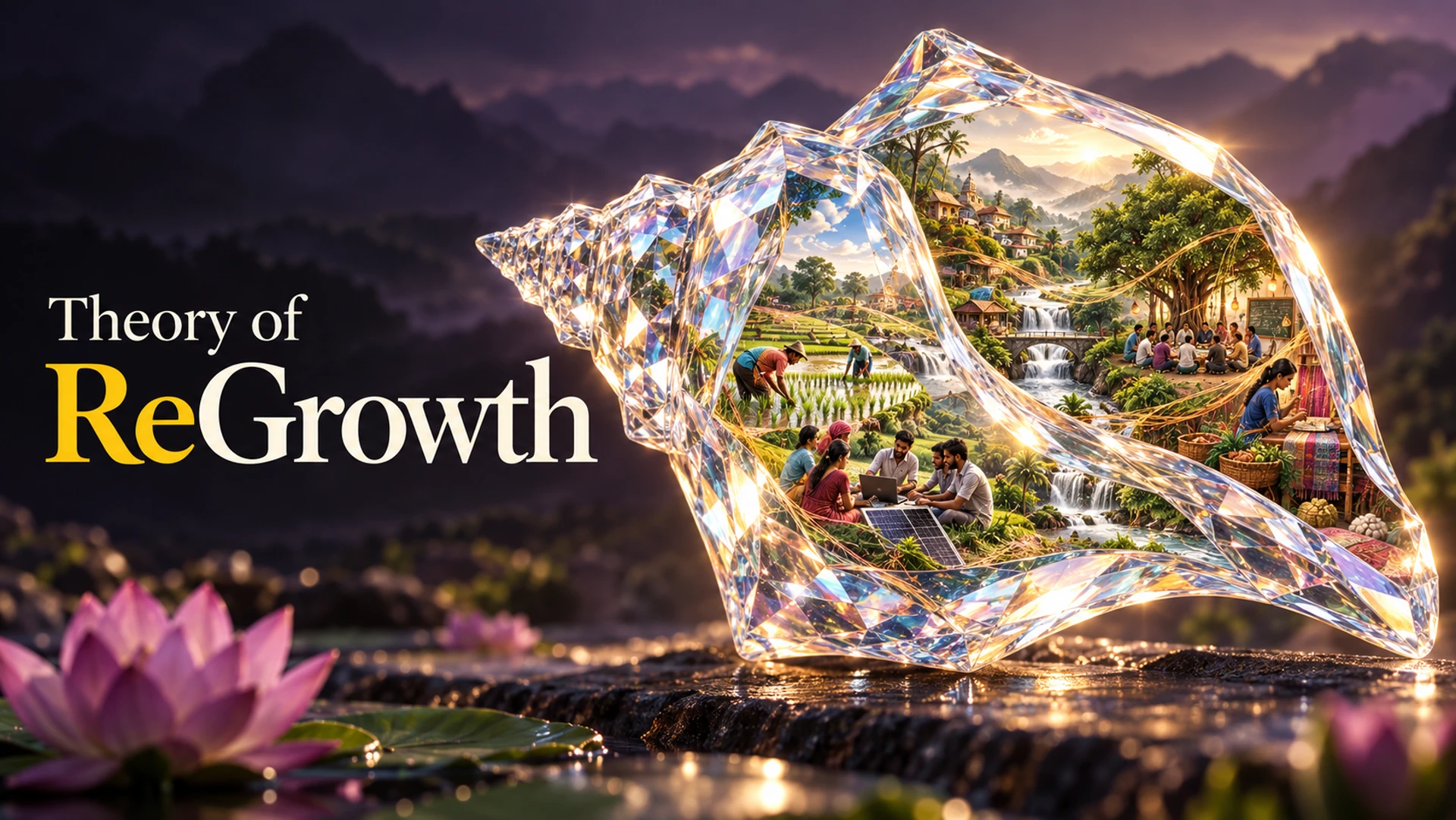
The primary series artwork and the anchor for our visual system. Keep the complete composition; its title is already part of the image.
Original artwork · PNG ↓A wider world of people, work and interdependence. Use for institutional stories and expansive landscape compositions.
Living tapestry · WebP ↓The everyday language
Cream and ink carry the reading. Yellow gives emphasis. Richer colours live inside the artwork. One strong image should have enough room to be felt.
Melodrama for the display voice. A clear sans serif for interfaces. Georgia for selected supporting lines. Keep the hierarchy generous and the body copy easy to read.
A conch is a starting point, not a stamp for every image. Choose the real subject first, then let refraction, material and composition reveal something about it. People, care and ordinary work belong inside the world.
Vande Padmakaram (Post-Rock Ambient), credited to uncommonidentity, is the ReGrowth theme. It plays only when a visitor chooses to listen.
For identifying and presenting ReGrowth accurately. Preserve credits. These illustrations do not document operating projects. The kit does not grant a blanket licence to third-party inputs or imply endorsement.